maanantai 9. elokuuta 2010

Turku Design Now! shop in 2011 Kulma

Turku Design Now! (http://www.turkudesignnow.fi/) is a collaboration of ten independent design companies from Turku. Together they have combined their resourcies to gain more visibility and to improve their operations. What combines all of these companies is that all of their products are being designed and hand produced in Finland. The collaboration has existed since 2008.

Turku has been chosen to be the European Culture Capital 2011 (http://www.turku2011.fi/uutiset/design-shop-tuotteet_fi). The city has established an information desk and a meeting point called 2011 Kulma in Turku city center by river Aurajoki (in address Kristiinankatu 1). In 2011 Kulma premeses they offer information linked to the culture year, tickets are been sold to the events, and also they have a café and a Design Shop there. Turku Design Now! group sells their products for three months in Kulma 2011 Design Shop. Here are a few examples on what is being presented in the shop.
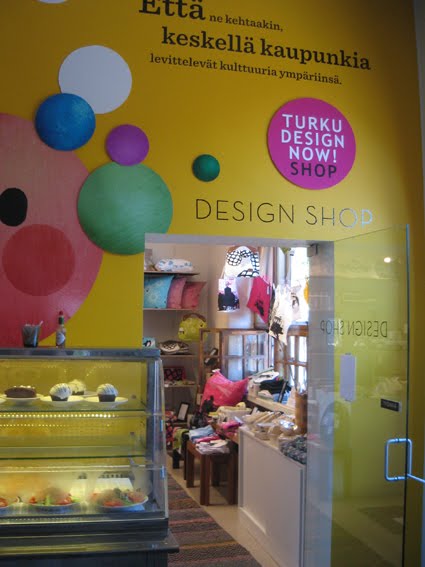
Entrance of the shop

The overall look of the store
Woodloop

Woodloop (http://www.woodloop.fi/) is a company started up by an architect and designer in wood Tero Pelto-Uotila. The company produces design items made of wood, such as furnitures and wall rugs, but also body care products. In 2011 Kulma shop there was presented these Kuura body care product which is for washing, peeling and massage of the body and skin. Kuura is complitely made of wood, which has been processed harsh by strong water shower to brake the surface of the wood. The invention is protected with a patent.


Kuura body washer

On the wall just next to the entrance there was on display a wall rug by Woodoo. The surface of the wall rug is processed the same way than on Kuura washer, and the harsh look fits both the products very well. This wall rug has a very contemporary look and I believe it doesn't only create modern yet warm look to a space, but it also isolates voices a bit. I personally like the way that tradition (material and function of the products) and modernism (form and design) is been combined in these products.

A wall rug by Woodloop

Klo Design

Klo Design (http://klodesign.fi/) is a design company, which is formed by young designers from different branchies of design. The company's collection includes furniture, interior textiles and accessories. I really liked the look of these products. I think the products looked very fresh and youthful and the textile pattern designs were the same time modern and timeless. To me this is the way of contemporary Finnish textile design.
Klo Design's fresh-looking decorative pillow cases.
Kui Design

The landscape of Turku was presented very well in the design products of Kui Design (http://www.kuidesign.com/). The young designers Rebekka Ketola and Anna Hormio are clearly very proud of their home town as they have illustrated charasteristic places of Turku in their textiles. Personally I'm not sure if I'd like to have a pillow or bag that says Turku because it's not my home town. But I liked the graphic look on these products very much! The also liked the way that the designers had included places from their home town to the products: they had used the grid plan and the silhuettes of charasteristic buildings of Turku ogenher on the prints. Maybe tha picture is enough? I think if the word "Turku" wasn't stated in these products, they might have even more commercial potential? My favourite print was the picture of "Föri", a ferry that carries pedestrians and bikers across Aura river. And I think the illustration worked perfectly n it's own, without any text.


Föri print

Punainen Norsu

Punainen Norsu (http://www.punainennorsu.com/) is a collection of children's wear made mostly of recycled materials. I loved the fabrics which have a popular retro-look, and the products design which I found very timeless. But what I liked most in these products was how child-like they were. I think they encourage for safe carefree childhood rather than offer trendy tank tops for small children. Pay attention to the display: the products hand from a branch of a tree! In my opinion this display strategy in very well in line with the design of the products.


Punainen Norsu's colourful children's wear

Tonfisk Design

The slogan of  Tonfisk Design (eng. "Tuna Fish Design") is: "Form follows function doesn't mean alla objects have to look the same". The Tonfisk Design's (http://shop.tonfisk-design.fi/PublishedService?&frontpage=true) products have their own unique form and design, but at the same time they have brilliant functional solutions in their products, too! For example in Newton milk & sugar set the sugar cup is on the top of the milk jug. The mechanism is based on gravity. While you tip the milk jug, the sugar bowl remains level. Beautiful form is combined with a functional design idea! All og the products are been produced in a ceramic factory in Turku.

Newton by Tanja Sipilä proves gravity! Included Metropolitan Home magazine's DESIGN 100 best of the best list.


The WARM range by Brian Keany was included in Wallpaper magazine's list of "A decade of Design".

Kasvu, an extendable vase by Brian Keany
WooDoo Design

WooDoo Design (http://www.woodoodesign.fi/etusivu.php) is a design office that designs and produces interior design products and furniture, but also designs interiors and fair departments. In 2011 Kulma shop was on desplay some of their products. WooDoo Design's products are made of wood, metal and glass, which are perfect for the contemporary, clear-lined and functional essence of these products.


All and all, in my opinion the range of design products in Turku Design Now! shop represented very high quality of contemporary Finnish Design. Turku Design Now! -group's products are been sold there from the beginning of July untill the end of September. So there's still some left time to visit!

sunnuntai 8. elokuuta 2010

Lasipalatsi Design Markets in Helsinki 4.-7.8.2010


Lasipalatsi Design Markets (http://designmarkets.lasipalatsi.fi/index.php/in-english) was held in Helsinki city center on 4.-7.8. It's an event which brings together young Finnish designers to present and sell their products to the audience. The event took place in Helsinki city center, just behind Lasipalatsi building. Many of the products were jewellery or accessories, and recycling design was a very strong trend on this market. Here are some of the blogger's pickings from the event.

Best product ideas:

101 Skateboard Jewellery (101sb.tumblr.com) makes jewellery from old skateboards. The jewellery has a layered look because of the the structure of the board.

Youth vs. Future (http://www.youthvsfuture.com/) makes jewellery from feathers. First they dye the feathers, then they add a hardening ingredient and on the top there's a alyer of lacquer. As a result each product is unique.


Tiia Arkko's jewels have a personal message for you: they state you that you are wonderful ("Ihana"), or remind you to breath ("Hengitä").

Uusix (http://www.uusix.fi/) has made rings from old keys. Uusix workshops gives a job opportunity to unemployed. The products are made of recycled materials according to sustainable development and ethics.


Kiertokulku (http://www.kiertokulku.fi/) had made a lamp out of medicine cups. A bit kitch maybe, but I liked it.


Sami Rinne Design (http://www.samirinne.fi/) sold ceramic products, for example coffe cups. Even though I found the display of the products to be a bit messy, I think that the products were one of the best design products on the market. Simple and yet powerful.


I really likes the irony on these Hankala's jewels by Petra Hankaniemi (http://www.designoutlet.com/). I think they're perfect for anyone with a broken heart...

Best display innovations:


101 Skateboard Jewellery's (101sb.tumblr.com) products were made of used skateboards, so they were placed on old skateboards - a very perceptual way to communicate on the product ond it's origins.


Keko is a joinment of four different Jewel designers. They had placed their products on painted cake tins. Very innovative! The jewels on this picture are made by Anna Marianne Rintanen (http://annamarianne.blogspot.com/).


Poni Design (http://imlittlepony.blogspot.com/) makes different kinds of jewellery, accessories and decor products. All of their products are hand made in Finland. Their candy jewels were displayed very deliciously.


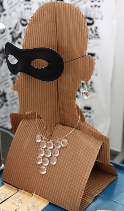
Creativity is about being able to do things on even when you're on a very low budget. Omstart (http://www.omstart.fi/) had made a display head out of corrugated cardboard to display their secon hand made jewellery. The material is ecological and it fits on a small space after use. A creative idea for the display of ecological second hand made products.


Bird of Passage (http://www.birdofpassage.fi/) is a jewellewry company by Salla Silvonen. She had made display platforms in varying heights by placing a glass on a pile of egg cartongs. The product details were written by hand on the glass. The dark glass offered a better background to the products than the transparent glass, though. But I also liked the fact that she had chosen to only put one piece of every product on display.

The blogger's personal favourites:


Bling Bling But Different (http://blingblingbutdifferent.blogspot.com/) makes broochies made of lace and pictures from books or old photos. And since I love almost anything that's made of lace, I really loved their nostalgic and over-romantic products! Perfect for a vintage style lover like me. And I loved the display - the broochies were displayed on an old silver tray. On the same desk there was displayed also Humbugi's accessories (http://www.humbugi.com/). Humbugi sells bags, purses, damasques and bracelets made of leather. Very feminine, very vintage, very...me!


Don't you just love the graphic design on these Poola Kataryna's products by designer Paula Kasurinen? I know I do! To me, this is almost like a whole design concept: theproducts, hang tags, logos, displays... Everyhting speaks the same language. Even the hangers! In my opinion, this label could have very good commercial opportunities.


Nonodd (http://www.nonodd.fi/fi/Etusivu.html) is a company of two designers, Tanja Aivila and Siri Huovila. Their products are graphical and fresh. Thay gain their inspiration from nature and from Helsinki city life. Perhaps my favourites were the  products with the illustrations of ice breaker Urho. The mass display was very well made.


First Crush (http://www.firstcrush.fi/) gives a whiole new life to old paper as a design item. Designer Mari Himmanen makes bags and jewellery out of laminated paper. I think this is a brilliant concept! The bags were made of old music sheets, maps, comics etc. The products were very well detailled. What a great concept!

About the event
It was obvious tha the companys were closely selected to this happening  which I found very good. Compared to Jyväskylä Design Market (there's a previous posting about this event in this blog), this was a very well organized and advertised event. Many of the companys were small in size, and their products were sold in small series so that a customer can feel that she/he is buying something unique. The organizers had also given effort to the event as a concept. There as a dj's playing music and other happenings in addition to the selling of the products, such as a dance performance. I found this to be was a very positive feature for this happening: it was more than an event, it was an event.

Main themes were ecology, recycling and making by hands

Most of the companies sold products that were made of second hand and recycled materials. Sustainable development in design could be seen as a supporting theme if this event. Some companies were able to make very nice design products by recycling materials, but of course some of the products were more like kitch rather than design.
Kitch or design?

Display in the design markets

Compared to the display in Jyväskylä Design Market, I found the displays of the companies in tis design market very innovative. I loved the fact that the designers had actually put some effort on thinking alternative ways for display. Most of the designers had innovated new ways to present their products, and the idea had often something to do with the idea of the product, so that there was a dialogue between the product and the display strategy. Some companys succeeded in display better than the others. One caution that I made was that the less products there were on display, the better the display usually looked. Especially on products that are minimalistic on their form, I think it would be a good idea to put just one piece of each product on display and have a stock on yhe selling items under the board. When the style of the products is more voluminous, the display strategy can also be accordingly more generous.

However, I found this design event to be a very good stage for young Finnish designers to present their products for the customers. And for the customers if was a great opportunity see a cut through on the products of the young designers. In addition, this was also commercial for Finnish Design aboard, since there were many tourists as visitors.

torstai 29. heinäkuuta 2010

Design and the City Pre-Course Assignment 2 - Fennokraft's Five Corners Panels

The second pre-course assignment was to describe a design product linked to or made in the place I come from / the place where I study. It could be an object of common use, a piece of furniture, a piece of clothing… The meaning was to concentrate especially on:* How does the object evoke that place?* Which are the instruments used to communicate the place? Is it the use of a certain material? Is it the shape that the object has? Is there any narrative contextual to the object, which links it to the place? Is there any historic connection?

Fennokraft's Five Corners Panels

I was reading Finnish Design Yearbook 2010-11, when I came across to a Finnish company named Fennokraft. They had designed a wooden wall panel called Five Corners, which is a place in southern Helsinki. Its a crossing, where five streets meet each other forming an unique environment. It's a very well-known landmark in Helsinki. The area is higly respected and the appartments are very wanted in the estate market because of the location and the beautiful buildings.The houses in the five corners block are triangular and their form brings in mind the famous Iron House in New York, although the orginal is much sharper than the houses of five corners. These beautiful buildings are being illustrated in the wallpanels by Fennokraft.

Fennokraft is a Finnish design company located in Helsinki. The inspiration to their design products come from Finnish nature and mythology. "The unique history of Fennoskandia, it's geography and way of life, combined with it's art and design are the building blocks of what makes every piece unique" they state in their website (http://www.fennokraft.com/). "Fennokraft limited editions come in low limited numbers, with a numbered seal of authenticity, and once their number has been reached, no more will ever be produced" says their promise to the customers. The craftsmen and artists process the products in Lahti and Helsinki. Fennokraft's product range also includes skillfully made cabinets, tables, chairs and stools. All of their products are a combination of graphic art and furniture design.

The Five Corners wall panels are made of various wood and black ink. The drawings of old houses are printed in black ink on thin wood vaneer. The contrast between light wood and dark ink looks interesting and I think it works very well. The soft wood offers an excellent background to hard-looking ink.


The graphic line is tender and almost fragile as it is so thin. Still the illustration is powerful, thanks to the black colour of the ink. The houses are pictured quite detailled from the corners/fronts, but the sides of the houses are been pictured merely by lines. This brings the attention to the corners and allows the illustration to breath also bringing space and air between the houses. The houses kind of melt together in the backof each house, the horizone vanishes between the houses. When you look at one row it's almost like looking a panorama picture of the scenery.

The pattern is formed by five different drawings, which form the five famous corners of the place. The illustrations form rows and lines on the panel. Each illustration of one house then formes a diagonal line, which gives dynamics to othewise even forms.


The panels form a very strong element on the wall when used as a big surface in interiors. I think it might need a lot of space around it, and the surrounding materials and furniture might have to be very minimalistic so that the panels could be at shown it's best on the wall. I would find it very interesting to see an example of an interior decorated with these panels. I wonder what would the space be like in which these wall panels wold be shown in their best? Is it a flat or a public space? What kind of furniture and colours would it go best with? Would the space maybe be situated in one of the houses in five corners?