The second pre-course assignment was to describe a design product linked to or made in the place I come from / the place where I study. It could be an object of common use, a piece of furniture, a piece of clothing… The meaning was to concentrate especially on:* How does the object evoke that place?* Which are the instruments used to communicate the place? Is it the use of a certain material? Is it the shape that the object has? Is there any narrative contextual to the object, which links it to the place? Is there any historic connection?
Fennokraft's Five Corners Panels
Fennokraft's Five Corners Panels
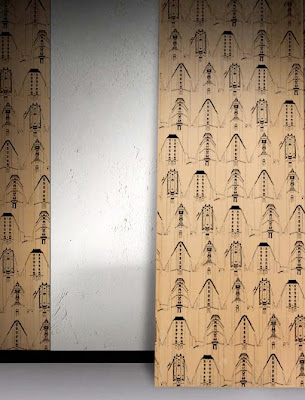
I was reading Finnish Design Yearbook 2010-11, when I came across to a Finnish company named Fennokraft. They had designed a wooden wall panel called Five Corners, which is a place in southern Helsinki. Its a crossing, where five streets meet each other forming an unique environment. It's a very well-known landmark in Helsinki. The area is higly respected and the appartments are very wanted in the estate market because of the location and the beautiful buildings.The houses in the five corners block are triangular and their form brings in mind the famous Iron House in New York, although the orginal is much sharper than the houses of five corners. These beautiful buildings are being illustrated in the wallpanels by Fennokraft.
Fennokraft is a Finnish design company located in Helsinki. The inspiration to their design products come from Finnish nature and mythology. "The unique history of Fennoskandia, it's geography and way of life, combined with it's art and design are the building blocks of what makes every piece unique" they state in their website (http://www.fennokraft.com/). "Fennokraft limited editions come in low limited numbers, with a numbered seal of authenticity, and once their number has been reached, no more will ever be produced" says their promise to the customers. The craftsmen and artists process the products in Lahti and Helsinki. Fennokraft's product range also includes skillfully made cabinets, tables, chairs and stools. All of their products are a combination of graphic art and furniture design.
The Five Corners wall panels are made of various wood and black ink. The drawings of old houses are printed in black ink on thin wood vaneer. The contrast between light wood and dark ink looks interesting and I think it works very well. The soft wood offers an excellent background to hard-looking ink.
The graphic line is tender and almost fragile as it is so thin. Still the illustration is powerful, thanks to the black colour of the ink. The houses are pictured quite detailled from the corners/fronts, but the sides of the houses are been pictured merely by lines. This brings the attention to the corners and allows the illustration to breath also bringing space and air between the houses. The houses kind of melt together in the backof each house, the horizone vanishes between the houses. When you look at one row it's almost like looking a panorama picture of the scenery.
The panels form a very strong element on the wall when used as a big surface in interiors. I think it might need a lot of space around it, and the surrounding materials and furniture might have to be very minimalistic so that the panels could be at shown it's best on the wall. I would find it very interesting to see an example of an interior decorated with these panels. I wonder what would the space be like in which these wall panels wold be shown in their best? Is it a flat or a public space? What kind of furniture and colours would it go best with? Would the space maybe be situated in one of the houses in five corners?
The Five Corners wall panels are made of various wood and black ink. The drawings of old houses are printed in black ink on thin wood vaneer. The contrast between light wood and dark ink looks interesting and I think it works very well. The soft wood offers an excellent background to hard-looking ink.
The graphic line is tender and almost fragile as it is so thin. Still the illustration is powerful, thanks to the black colour of the ink. The houses are pictured quite detailled from the corners/fronts, but the sides of the houses are been pictured merely by lines. This brings the attention to the corners and allows the illustration to breath also bringing space and air between the houses. The houses kind of melt together in the backof each house, the horizone vanishes between the houses. When you look at one row it's almost like looking a panorama picture of the scenery.
The pattern is formed by five different drawings, which form the five famous corners of the place. The illustrations form rows and lines on the panel. Each illustration of one house then formes a diagonal line, which gives dynamics to othewise even forms.
The panels form a very strong element on the wall when used as a big surface in interiors. I think it might need a lot of space around it, and the surrounding materials and furniture might have to be very minimalistic so that the panels could be at shown it's best on the wall. I would find it very interesting to see an example of an interior decorated with these panels. I wonder what would the space be like in which these wall panels wold be shown in their best? Is it a flat or a public space? What kind of furniture and colours would it go best with? Would the space maybe be situated in one of the houses in five corners?


 Kuvat 1 ja 2: Anu Pylsyn design-tuotteiden tehtaanmyymälä Joutsassa
 Kuvat 3 ja 4: Hannele's -sisustusmyymälä Leppävedellä
 Kuva 5: Savutuvan Apaja Jyväskylässä
 Kuvat 6 ja 7: Strömforsin ruukkimiljöö Ruotsinpyhtäällä
 Kuvat 8 ja 9: Turku Design Now! -myymälä
